Dash is a tool designed for building interactive dashboards and web applications using only Python (no CSS, HTML, or JavaScript required). I came across Dash while surveying options for building dashboards and reporting tools in my current position as Data Scientist with the City of Winnipeg Transportation Division.
Why use Dash?
Some of the lowest-hanging fruit working as a data science involves simply getting the data in front of the right people in a way that is easily digestible and actionable. No fancy ML, just presenting data to the right people at the right time in the right format. Dashboards are often a great way of doing that.
However, they can be a pain to build. Off-the-shelf dashboard tools like Tableau and PowerBI can be expensive and limiting (you are constrained to the features that they choose to include in their software). Developing dashboards from scratch as a web application is also a pain, since that often requires writing CSS, HTML, and JavaScript: as a data scientist, your focus is typically programming in python or R and your job typically does not require being an expert in JavaScript.
Dash strikes a perfect middle ground for a data scientist, providing way more flexibility and customizability than off-the-shelf tools at a much lower cost (i.e. free), while still having an easy-to-use API that a python-oriented data scientist should not have difficulty grasping.
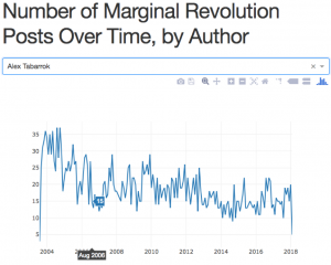
A Demo Dash app of Blog Post Data from Marginal Revolution
To become familiar with Dash and see what it can do, I started out with a simple dashboard using some of the the scraped blog post data from Marginal Revolution (see this post on the MR scraper project). You can find the dashboard here, which provides an interactive chart of the number of posts on Marginal Revolution over time for each author. You can choose any of the authors in the drop down box, and the relevant data shows up in the chart:
I have to say, I can’t believe how easy it was to build this dashboard. In total, it’s only 33 lines of python code (you can find the code here. It was also easy to deploy to heroku, following this guide.
How Dash Works
I highly recommend going through the Dash tutorial here, which walks you through app creation and the main components of Dash. Here I’ll give a high level overview of some key points.
Dash apps have two components: a layout component which describes how the application looks visually, and an interactivity component which specifies how your dashboard interacts with the user and responds to input.
Layout Component
The layout defines what the dashboard looks like. When defining the layout of your application, you create a hierarchical “tree” of components, and each component will come from one of the following two main classes:
- dash_html_components: This includes a component to represent every HTML tag. E.g. dash_html_components.H1(children = ‘Hello Dash’) adds <h1>Hello Dash</h1> to your dashboard.
- dash_core_components: This describes higher-level components that combine HTML, JavaScript, and CSS created through the React.js library. These components have an interactive element to them (e.g. graphs with tooltips). One of the key classes within dash_core_components is Graph. Graph components represent data visualizations created using plotly.js (Plotly is the company that created Dash). Graph provides 35 different chart types to meet your needs. Another nice feature included within dash_core_components is the ability to include Markdown, which is often more convenient for presenting text based copy in your dashboards. There are many other options available to you in the dash_core_components library to use in your dashboard (e.g. sliders, checkboxes, date ranges, interactive tables, tabs, and more – see the gallery here).
To define the layout for a page and the data contained within it, you nest these various components as appropriate. You assign this nested list to app.layout, where app = dash.Dash(). To see an example of how these components fit together and how they are rendered in the browser, see the getting started page on the Dash tutorial.
Interactivity Component
Another key feature of Dash is its ability to respond to user input and change the visualization accordingly (dashboards aren’t really of much use without this feature). Dash makes this functionality quite easy, although there is a bit too much to go into great detail in this blog post. Read part 2 of the Dash user guide.
In short, Dash lets you add interactivity by adding an @app.callback decorator to a Python function you write which takes the input from one of the layout components and returns outputs to send to another layout component that you want to change according to the new input.
You can have multiple inputs and multiple outputs. For example, if you want a graph that gives the user the option of filtering by multiple variables in your dataset, you can use multiple input filters. The function that you apply the @app.callback decorator to automatically fires whenever there are any changes to any of the inputs.
Deploying to Production
Dash uses the python Flask web application framework under the hood. Flask is an awesome, lightweight web application framework for Python that is definitely worth knowing (and relatively easy to learn given how stripped down it is). You can access the underlying Flask app instance using app.server where app is the instance of your dash app (i.e. app = Dash()).
Since the Dash app is essentially a Flask app under the hood, deploying a Dash app is the same as deploying a Flask app, and there are many guides online for deploying flask apps in a variety of situations. The Dash website provides some more details about deployment as well as steps for deploying to Heroku.
Comment below if you have any questions or if you want to share your experience using Dash!
Further Resources
Dash User Guide and Documentation
Plotly.py Documentation and Gallery
Dash Community Forum