Here’s the situation: you have a dataset where each row represents some type of event and the time it occurred. You want to build a system to let you know if there were unusual events occurring in some time period (a common application). You also want your users to be able to explore the events in more detail when the get an alert and understand where the event sits in the history of time the data has been collected.
After starting a task similar to this at work, I broke it down into the following parts (each of which will receive a separate blog post):
- Using historical data to understand what is “unusual” (Part 1 – this post):
- Reporting “unusual” events taken from a live feed of your data (Part 2): Developing a system that monitors a live feed of your data, compares it to historical trends, and sends out an email alert when the number of incidents exceed some threshold.
- Developing a front end for users to sign up for email alerts (Part 3): Developing a system for signing up with email to receive the updates and specify how often you want to see them (i.e. specifying how “unusual” an event you want to see).
- Creating interactive dashboards (Part 4): Developing dashboards complementing the alert system where users can look up current status of data and how it compares to historical data.
The Data: Obviously, this scenario applies to many, many datasets, but I have to pick something specific for this series. So, I’ll be using this dataset on air quality in the City of Winnipeg from Winnipeg’s open data portal. This data is perfect because it’s updated regularly (every 5 minutes), and there is historical data as well as a live feed API (you can find documentation on the API here). We’ll be using the historical data to help figure out what’s “unusual” and the live data as the basis for alerts by comparing its values against historical and provide alerts.
Data Exploration and Pre-Processing
After downloading our air quality dataset, we see it looks like this:
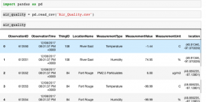
As you can see, there are different measurements in different rows, including Temperature, Humidity, and PM2.5 Particulates. Let’s filter our dataset to only contains information on PM2.5 Particulates (we only really care about air pollution in this application).
![]()
Looking at the values in MeasurementValue, we see it is measured in units of micrograms per cubic metre (ug/m3) and all values are positive integers. Plotting the histogram, you can see that almost all of the values are below 1,000, with a relatively small number of outliers around 5000.
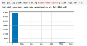
Counting the number of Measurement Values and filtering for lower values reveals that the vast majority of the observations are less than 100.
Looking at the Measurement Values greater than 100 confirms that there are no observations between 500 and 5,000, with a sudden spike around 5,000.
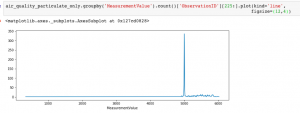
I don’t have domain expertise related to air quality measurement and the nature of the sensors used to collect this data; however, but the fact that there are no observations in this wide range suggests that these are measurement errors. Exporting the Measurement Values to a table shows that there is one observation with 673 ug/m3 and then the next highest observation suddenly jumps by almost an order of magnitude to 4892 ug/m3.
Given the clear cutoff from these outliers, we’ll set a threshold and define an observation as a measurement error if it is greater than 1000 ug/m3. So as a first step in our analysis, we’ll take out these outliers.
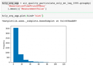
Once these have been filtered out, we’ll do a bit of aggregation across longer time periods. This helps further smooth out other one-off outliers that are likely measurement errors rather than a real increase in overall air quality in the city.
To do this, we put together a dataset that groups data into hourly chunks and takes the average particulate matter over that period. Plotting this out shows the average hourly particulate matter over the historical time period provided is between 0 and 120 ug/m3.
Determining Alert Thresholds
From this hourly dataset of average particulate levels, here’s the general approach we’ll take to determine what is “unusual”: we’ll define some percentile threshold where we want to be alerted, and call anything above this threshold “unusual”.
Python’s pandas package has a nice Series.quantile() function to help out with this: you pass in the quantile you’re interested in and it pops out the value in your data representing that quantile. For example, if you want to see the value representing the 95th percentile in our hourly average air quality data (hrly_avg_aqp), then you would write this:
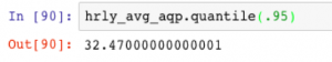
The 95th percentile in the dataset is 32.47 ug/m3.
The next logical question is: what percentile threshold should we use to send alerts?
One way to think about this is how often you would like to or expect to see emails about these events. Being alerted about 99th percentile events seems like it might be rare enough. However, remember that we are collecting data by the hour; which means if you set a 99th percentile criteria, that means you would receive an email in about 1 out of every 100 hours or about once every four days. For our application, this seems like far too many alerts: we want to hear about the rare air quality events (e.g. once a year events).
As a solution, we’ll leave it to the user to input about how rare an event they want to receive alerts for: once-in-two-years events, once-in-a-year events, six-in-a-year events, or once-in-a-month events. Since we’re looking at hourly data, if a user specifies the number of alerts they want to receive per year (n_alerts_per_year), the calculation of the appropriate percentile threshold is:
percentile_threshold = [1 - n_alerts_per_year / Total Number of Observations in a Year] * 100 = [1 - n_alerts_per_year / (365 * 24)] * 100
So now we have all the fundamental pieces of data we need: when the user specified n_alerts_per_year, we calculate the percentile threshold using the calculation above, and then finally, we can calculate the threshold value of air quality that should set off an alert for that user with
hrly_avg_aqp.quantile(percentile_threshold)
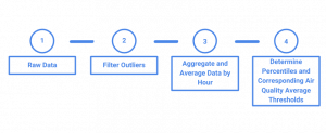
Here’s an overview of our data pre-processing steps for our unusual event application.
What’s Next?
Now that we have the basic data in place for understanding what levels of air quality are “unusual”, in Part 2 of the series we’ll write code to ingest the JSON data feed of air quality readings reporting “unusual” events based on your data developed in #1 and the live data feed (Part 2): A system that regularly monitors a particular “feed” of incidents, compares the number of incidents with historical data, and then sends out an email whenever the number of incidents exceed a percentile threshold.